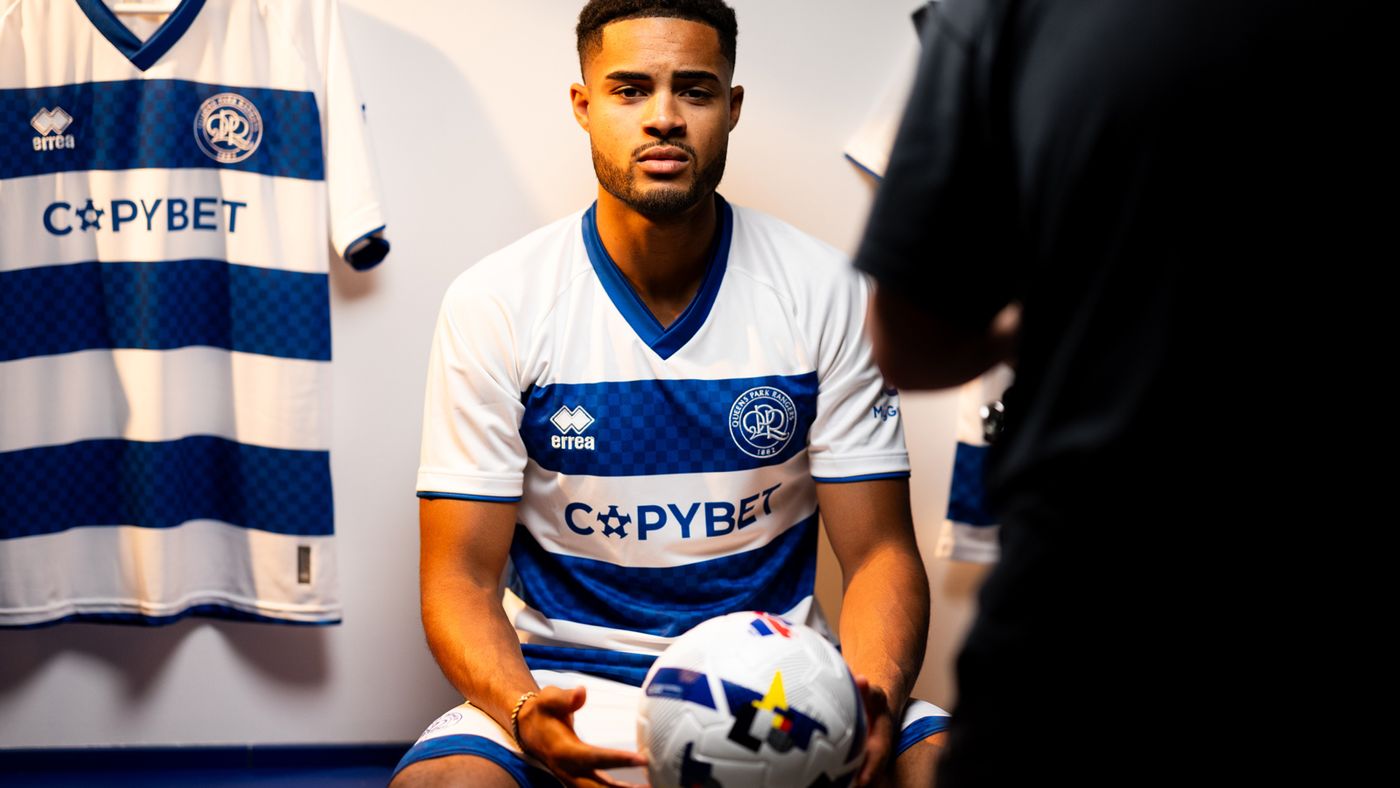
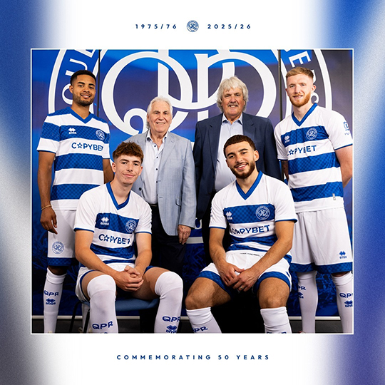
| The new kit 08:03 - Aug 1 with 11948 views | dandaqpr |
Just blue and white, great 👏👏👏 |  | | |  |
| The new kit on 09:45 - Aug 1 with 2511 views | PlanetHonneywood |
| The new kit on 09:13 - Aug 1 by BushRanger82 |
Nothing like the 75/76 kit.
Too much white on sleeves and shoulders.
The long sleeved version will be even more horrendous.
Will continue to wear my Dryworld classics! |
While my first thoughts are, I like it. I think you've aired what I'm now thinking: maybe just a bit too much white. However, its livable with. |  |
| |
| The new kit on 09:47 - Aug 1 with 2505 views | CamberleyR |
| The new kit on 09:12 - Aug 1 by BazzaInTheLoft |
One thing I do appreciate on recent kits, is the white shorts.
We dabbled with blue shorts for a while didn't we. |
Only one season, 2008-09.
 |  |
| |
| The new kit on 10:10 - Aug 1 with 2372 views | charmr |
Personally I think Francis does a great job with the kits every year and has a great eye for design. You also never know how many restrictions are placed on him and also has to come up with 3 new ideas every season. He’s fellow Ranger who cares about this stuff.
The colours are going to be more subjective of course. Personally it’s when the collars of a shirt aren’t kept simple it can displace the whole design.
There is a constant array of abominations turned out as kits every year by clubs. Norwich this years home looks great. Their away pink this year, anyone care to post please, shocking. | | | |
| The new kit on 10:12 - Aug 1 with 2358 views | BazzaInTheLoft |
| The new kit on 10:10 - Aug 1 by charmr |
Personally I think Francis does a great job with the kits every year and has a great eye for design. You also never know how many restrictions are placed on him and also has to come up with 3 new ideas every season. He’s fellow Ranger who cares about this stuff.
The colours are going to be more subjective of course. Personally it’s when the collars of a shirt aren’t kept simple it can displace the whole design.
There is a constant array of abominations turned out as kits every year by clubs. Norwich this years home looks great. Their away pink this year, anyone care to post please, shocking. |
Yeah, if you are reading Francis, please don't mistake my grumbles for ungratefulness.
They are all nice kits all in all and you can't please everyone. [Post edited 1 Aug 10:12]
|  | | |
| The new kit on 10:13 - Aug 1 with 2353 views | elnombre |
| The new kit on 09:47 - Aug 1 by CamberleyR |
Only one season, 2008-09.
|
2004/5 Binatone and 2010/11 Gulfair, we also wore blue shorts with the hoops - away, and very occasionally, I think - someone must have the same vague 'I remember blue, you're not my daughter, have I had my tea' recollection as I do... | | | |
| The new kit on 10:17 - Aug 1 with 2323 views | CamberleyR |
| The new kit on 10:13 - Aug 1 by elnombre |
2004/5 Binatone and 2010/11 Gulfair, we also wore blue shorts with the hoops - away, and very occasionally, I think - someone must have the same vague 'I remember blue, you're not my daughter, have I had my tea' recollection as I do... |
May have worn blue shorts occasionally away as we always usually do when the oppo has white shorts but the 2004-05 and 2010-11 kits had white home shorts which I think is what Baz was alluding to, having blue home shorts. | |
| |
| The new kit on 10:19 - Aug 1 with 2312 views | CamberleyR |
| The new kit on 10:10 - Aug 1 by charmr |
Personally I think Francis does a great job with the kits every year and has a great eye for design. You also never know how many restrictions are placed on him and also has to come up with 3 new ideas every season. He’s fellow Ranger who cares about this stuff.
The colours are going to be more subjective of course. Personally it’s when the collars of a shirt aren’t kept simple it can displace the whole design.
There is a constant array of abominations turned out as kits every year by clubs. Norwich this years home looks great. Their away pink this year, anyone care to post please, shocking. |
Truly gash
 | |
| |
| The new kit on 10:24 - Aug 1 with 2271 views | Superhoop83 |
| The new kit on 10:19 - Aug 1 by CamberleyR |
Truly gash
|
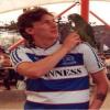
Modelled on my nan's tablecloth 1975/76. |  |
| |
Login to get fewer ads
| The new kit on 10:26 - Aug 1 with 2261 views | AS86 |
I like it and went to buy my son his first kit...but why does it have the terrible youth team sponsor (which is far too long winded) on it?
I get it can't have Copybet on kids shirts, but why don't they just leave it blank like previous years. |  | | |
| The new kit on 10:26 - Aug 1 with 2260 views | BklynRanger |
I like it a lot, but is it my imagination or doesn't the ladies kit normally taper a bit more than the men's?
On the shop page they look identical in shape.
Either way I probably don't have the physique to carry off the home shirt these days. Something to aim for maybe. |  | | |
| The new kit on 10:32 - Aug 1 with 2236 views | Jimboqpr |
Pretty nice kit, I like the checkered pattern on the blue. I'm not sure about having 'Xtra maintenance' stamped just above my arse though. Despite that statement being more true with every passing year. | | | |
| The new kit on 10:41 - Aug 1 with 2189 views | Wilkinswatercarrier |
Beautiful kit. Nice and simple, but love the checks as not to busy. I think it looks better without the blue shoulders. | |
| |
| The new kit on 10:53 - Aug 1 with 2136 views | Juzzie |
| The new kit on 10:26 - Aug 1 by AS86 |
I like it and went to buy my son his first kit...but why does it have the terrible youth team sponsor (which is far too long winded) on it?
I get it can't have Copybet on kids shirts, but why don't they just leave it blank like previous years. |
£££
I like the new kit, though having a blue bar on the sleeve and maybe just a little across the top of the shoulder would be nice so there isn't too much white but that's just me nit-picking.
The chequered effect is a nice homage to the 70's programme and will probably be hardly noticeable at the game or on TV.
I think the 3rd kit is the best of all the green/white hoops that we've done.
I'm OK about the away kit, always going to happen at some point as it's in fashion at the moment.
[Post edited 1 Aug 11:46]
|  | | |
| The new kit on 11:35 - Aug 1 with 1986 views | ed_83 |
Really like it, clean and classic. Definitely a little too much white on the shoulders, but that’s nitpicking. Still think the 21/22 Ashville Holdings home shirt is our best of recent years, but this is a close second for me.
I know a lot of people don’t like the pink and black halves, but you can clearly see the commercial thinking behind it, and I think they’ve done a relatively tasteful / competent job, regardless of personal taste. That Norwich shirt is absolutely grim, and a useful reminder of how bad things could be. | | | |
| The new kit on 12:03 - Aug 1 with 1862 views | kensalriser |
| The new kit on 10:19 - Aug 1 by CamberleyR |
Truly gash
|
Contestants: your challenge is to eat beetroot and create a stylised image of a pig doing the can can by completing a Rorschach test with your vomit.
The winner’s image will be used for this season’s Norwich City away shirt. |  |
| |
| The new kit on 12:06 - Aug 1 with 1855 views | joe90 |
For me this is the best home kit we've had from Erra.
White crest and red numbers/names look so much better.
The checkered pattern is more subtle and IMO works better than last seasons 'fade'. I like the white across the top as it emphasises the three hoops. The kicking man is also a nice little detail.
I would love a version without all the sponsors on it.
 |  | | |
| The new kit on 12:09 - Aug 1 with 1843 views | simmo |
I like it. Appreciate some may not like the cheques, I didn't really like the shades of blue on last years kit, but when the brief has to include three hoops I guess there's only so much you can do to show innovation.
I think they've done a good job to keep it QPR and show knowledge about our history, I also like the cheque detail on the shorts that link the kit together. My only slight criticism is v neck over rounded, but it looks fine and that's the main thing! |  |
| ask Beavis I get nothing Butthead |
| |
| The new kit on 12:22 - Aug 1 with 1785 views | Juzzie |
On Varane, I added a blue hoop to the sleeve and a little blue across the shoulder.
 | | | |
| The new kit on 12:52 - Aug 1 with 1666 views | CateLeBonR |
Another fan of the home kit. There’s something for everyone in the kit selection this year, which is nice  |  | | |
| The new kit on 13:05 - Aug 1 with 1613 views | qpr1976 |
| The new kit on 12:22 - Aug 1 by Juzzie |
On Varane, I added a blue hoop to the sleeve and a little blue across the shoulder.
|
I'd prefer that.
But it's ok and what happens on the pitch is more important to me. | | | |
| The new kit on 13:19 - Aug 1 with 1528 views | Nov77 |
Nope, shoulders should be blue to maintain symmetry. |  |
| |
| The new kit on 13:21 - Aug 1 with 1513 views | Big_Mac |
| The new kit on 12:22 - Aug 1 by Juzzie |
On Varane, I added a blue hoop to the sleeve and a little blue across the shoulder.
|
If the cuffs had the blue chequered pattern, that would the perfect shirt for me |  | | |
| The new kit on 13:56 - Aug 1 with 1425 views | CLAREMAN1995 |
| The new kit on 09:17 - Aug 1 by TheChef |
Very nice. V neck always gets a thumbs up from me.
Arguably a bit too white, could use another hoop around the shoulders? |
I am the exact opposite TheChef love the collars as the V neck never fits well on me plus the new athletic taylor fit is not great either  . .
I would go a step further and like 3 buttons in the collar because I need that fit to look half decent and cannot go around with the top buttom closed if there is only 2 .
I love the green and white 3rd kit but have the Brooks one in the closet.
Unrelated but I wore my 85 Guinness shirt to the Hozier concert last week but nobody shouted Urssssssss sadly |  | | |
| The new kit on 15:51 - Aug 1 with 1240 views | Boston |
Decent kit, I'd prefer a little blue on the shoulders, maybe something on the sleeve, but it looks like us, so ok.
Thought the O in copy was the Star of David when I first clicked on the thread. | |
| |
| |